Impressionism, a historical reconstruction:
True colours?
a just representation of paintings
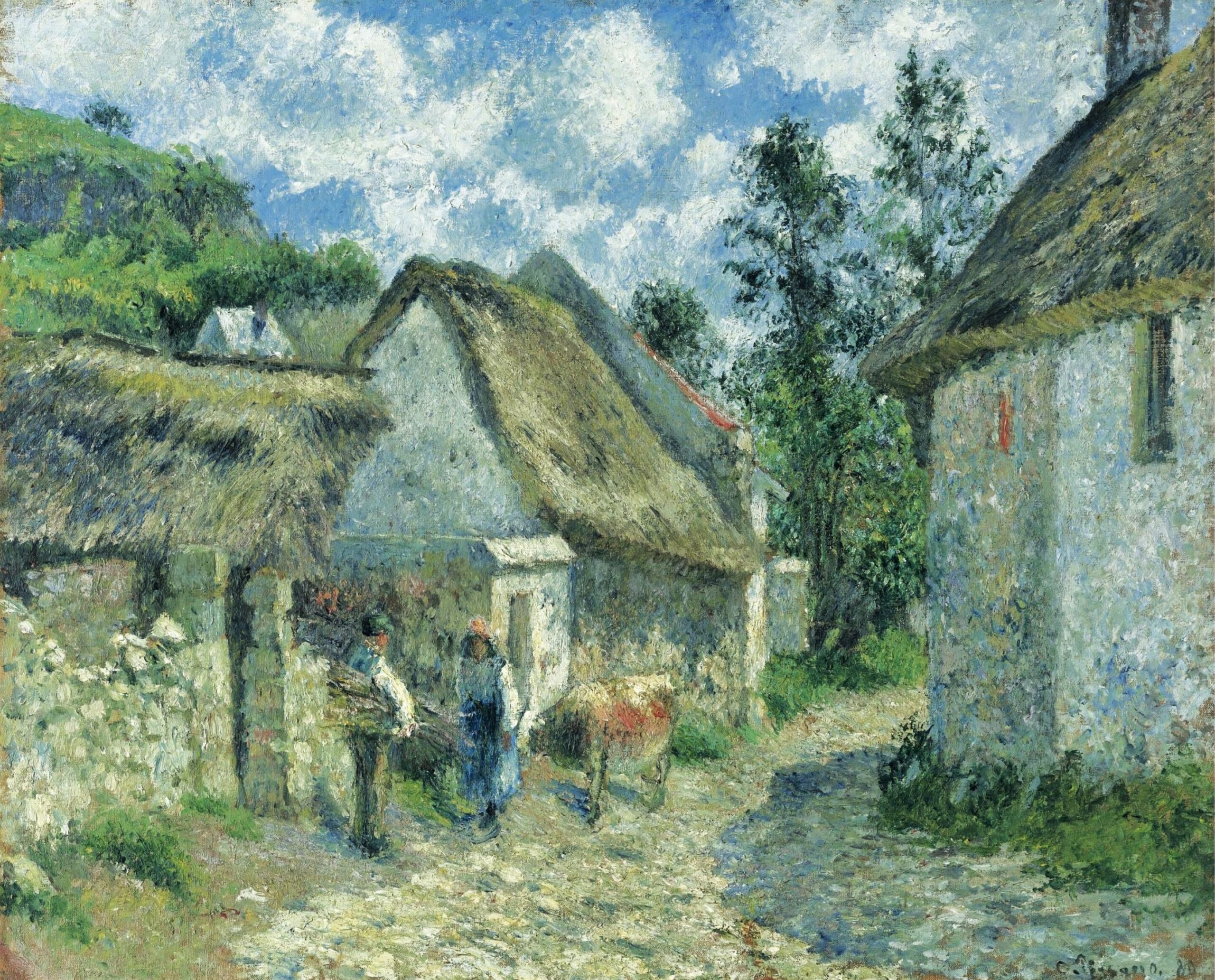
In making this website I come across various representations of one and the same painting. The colours in these paintings may vary a great deal. But, which colours, are the true colours?
These are technical questions that reach far beyond my knowledge*. What I understand is that (certain) colours fade throughout the years**. That after cleaning a painting looks less yellowish (though the impressionist hardly used varnish). That in commercial representations the colours often look too bright, even a bit screamy**.
On this page I will render some remarkable variations.
Note*: My colleague Otón Pabst (www.magrasku.de =iR59) shared some of his professional knowledge and points out that the reproductions of Impressionist paintings in
publications are almost all too dark, namely shadow parts are often rendered too blackish, which make the contrasts too strong. Certain colours have faded and lost their vibrancy throughout the years, namely yellow and red tones get paler. In reproductions, some colours are harder to render, namely turquoise.
Note**: that is why I subdue the colours of the some of the pictures I use. For example in the print I have of the excellent book of Walther on Impressionism (R3), the colours are quite screamy.


Recommanded citation: “Enjoy Impressionism: True colours; a just representation of paintings. Last modified 2026/09/12. https://www.impressionism.nl/true-colours/”
Note: additional examples will be added later on.