Introduction:
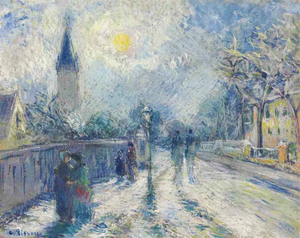
Maybe ‘purple shades’ is the shortest definition of Impressionism (as a painting style). Camille Pissarro emphasized this importance of rendering shades. Instead of the greyish shades that were mostly used, in the late 1860s the Impressionists started to use blue shades. When their painting style matured in the mid 1870s the Impressionists also started to use purple shades. Something Neo-Impressionists explicitly took over. We also see that some pre-impressionists already used some coloured shades. Armand Guillaumin maybe was the most progressive of the Impressionists, using colourfull shades in early years. At the end of this page you will find many examples of colourfull shades.
Greyish shades:
In most paintings shades are rendered with greyish shades.
Claude Monet: 1869/12, CR145, Sbl, Route, effet d’hiver, soleil couchant (Louveciennes), 43×65, MBA Rouen (iR10;iR94;R22,no145;M12) Provenance: Armand Gautier; 1889 Boussod, Valadon & Cie; 1889/12 Gustave Goupy; sale HD1898/03/30-26; 1898 François Depeaux; sale GP1906/05/31-30; Durand-Ruel. Expos: Prague-FI-1907-24.
Pierre-Isidore Bureau (1822-76): 18xx, SDbr (Pierre Bureau 82??) Hilly Road (chemin montant), 26×41, MUDO Beauvais (iR2;iR127;aR3;iR1;R2,p161). =?? S1874-284, Route de Champagne, près de l’Isle-Adam (Seine-et-Oise); =?? 2IE-1876-9, Route de Champagne, près l’Isle-Adam
Alfred Sisley, 2IE-1876-240, Labreuvoir de Marly, en hiver; Appartient à M. Martin = 1875, SDbl, CR152=CCPP199, The Watering Place at Marly-le-Roi, 50×66, NG London (M61;iR2;R2,p186;R90II,p45;R129,no199) Provenance: 1876 Pierre-Firmin Martin; Depeaux; sale HD1901/04/25-48.
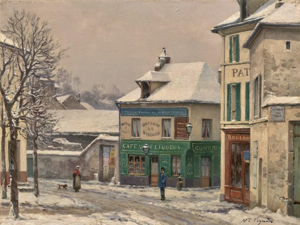
Victor Vignon, 5IE-1880-216, Effet de neige, Montesson. Maybe?: 1875-85ca, Sbr, Snow effect in a suburb, 25×33, CAI Williamstown (iR94;M26;R2,p314;iR1;R90I,p263;R90I,p308). =GP1919/12/01-223, Effet de neige dans un coin de banlieue, 25×33, Sbr (Former Hazard collection) (aR18=iR19;R232;R272,p30). Maybe?: BJ1921-35, Coin de village en hiver (R272,p31).
Black shades:
Sometimes shades were rendered by very dark hues, even with bitumen black. Adviced by DiazRenoir abandonned the use of bitumen black in the mid 1860s (R32,p12;R1,p96+100;R5,p30). Later in 1910, Auguste Renoir said during a workshop in Munich ‘Shadows are not black; no shadow is black. It always has a colour.’ (R1,p210)
Bluish shades:
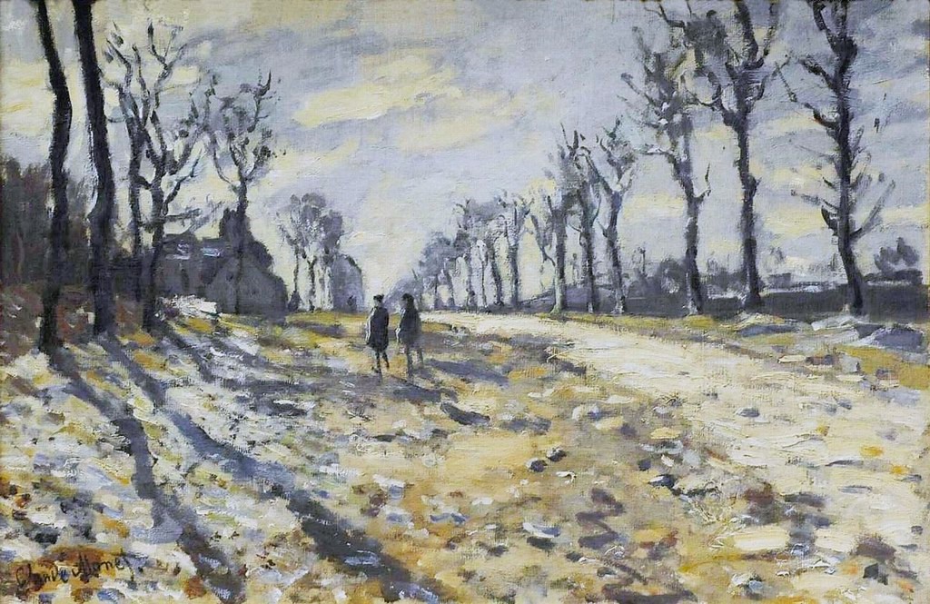
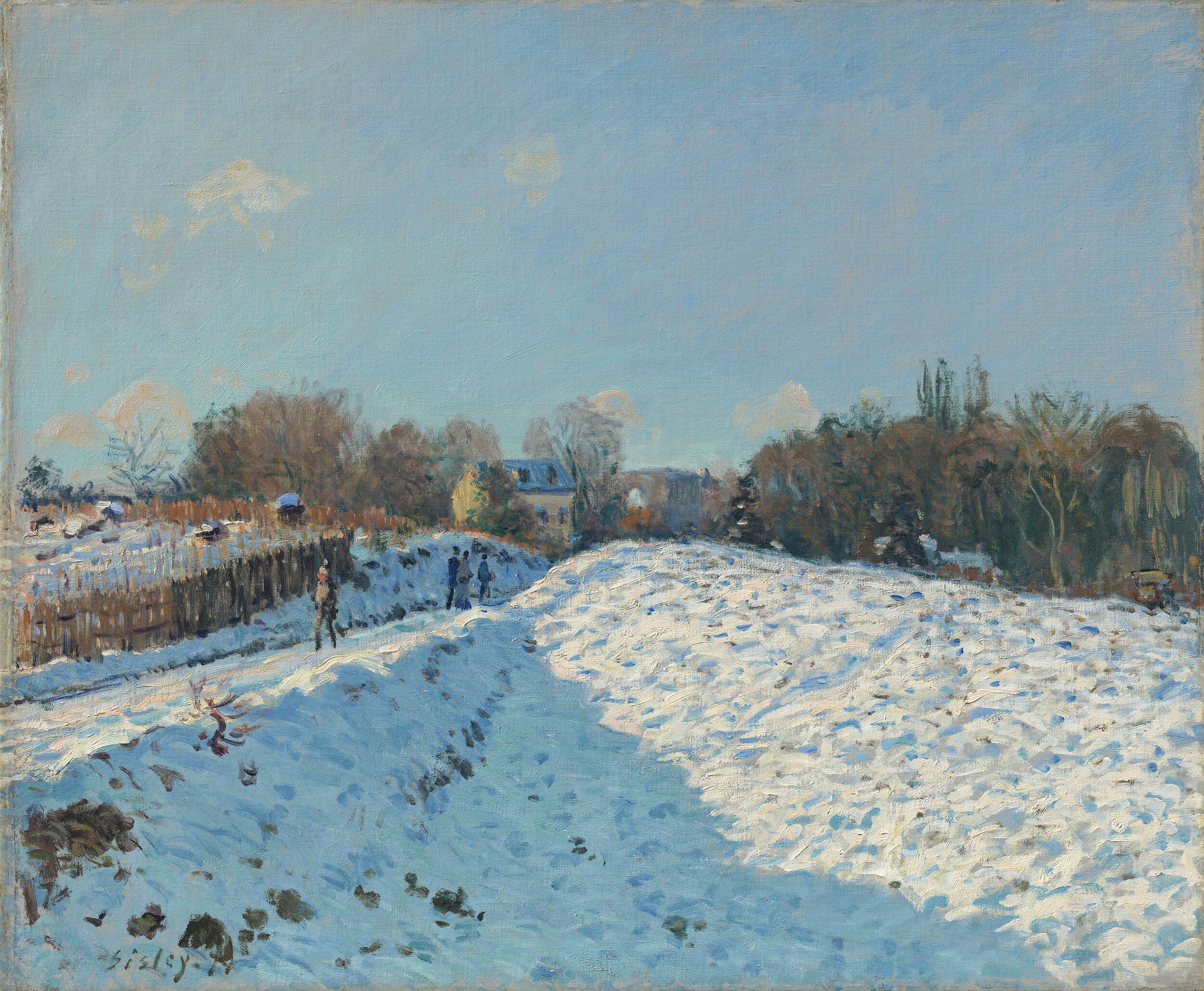
In the late 1860s the Impressionists started to use blue shades, namely for the shades in the snow on a sunny day, like in these paintings of Claude Monet and Alfred Sisley.
Claude Monet, S1869-R2. Now: 1869, CR133, The Magpie, 89×130, Orsay (iR2;R22,no133;M1)
Alfred Sisley: 1874, SDbl, CR147=CCPP142, Snow effect at Louveciennes, 54×65, MB Potsdam (iR10;M268;iR2;iR11;iR40;R38;R129,no147;R396,no142;R88II,p452) =?? 2IE-1876-237, Effet de neige. Provenance: =?? HD1875/03/24-69, Effet de neige (54×65) -> Durand-Ruel (200fr); 1892 Durand-Ruel; Depeaux; GP1906/05/31-59; Decap.
Rendering shades:
The development of how to render shadows is central in the development of the impressionist painting style.
Rewald decribed it in this way: The quest of how to render shades occupied the Impressionists, namely in the second half of the 1860s. Manet was of the opinion that it was preferable to pass abruptly from light to shadow. But his companions at the Café Guerbois who worked en-plein-air, such as Monet and Pissarro, thought otherwise. For them shadows played a unifying role instead of dividing their paintings into zones of light and darkness. The traditional way of rendering shadows, was to render the local-colour of an object more sober. The Impressionist observed complementary colours. Especially blue seems to dominate in the shades. It became clear to them that surroundings exposed to light, influence the colours of those parts remaining in the shade. For them, shadow areas were not colourless and not simply darker, but rather dark areas with rich hues that appear in complementary colors, especially in blue. The pitchy black tones for the shadow areas of the old masters were replaced. Shadows in the snow, for example, are not black, but rather blue, due to the surroundings, the sky. Later, in 1910 Renoir explained in Munich during a workshop that shades should be rendered as if a veil was thrown over an object. He stimulated to use thin, transparant pigments. (R1,p209+210; iR59)
Itten in his study on colour wrote: The Impressionists observed nature (en-plein-air) intensively and learned that the sunlight changed the colours of the objects in nature. Monet and others worked every one or two hours on another canvas because of the change of sunlight and it’s effect on the colours. In the same way they observed shadows, that were tradionally rendered in greyish and blackish tones. They observed that the orange light of the setting sun and the reflection of the blue sky, caused bluish shadows. This was most clearly to be seen in the snow. (R72,p11+81)
Pissarro on shadows:
In 1903 Camille Pissarro wrote about his time in London (1870/71): “Though we have learned some things of Turner and Constable, they showed in their work that they had no idea how to analyse shadow.” (R6,p101;R5,p71;R116I,p130). This remark shows, that in those early years when they developed their impressionist painting style, the rendering of shadows was an important element.
Greenish shades:
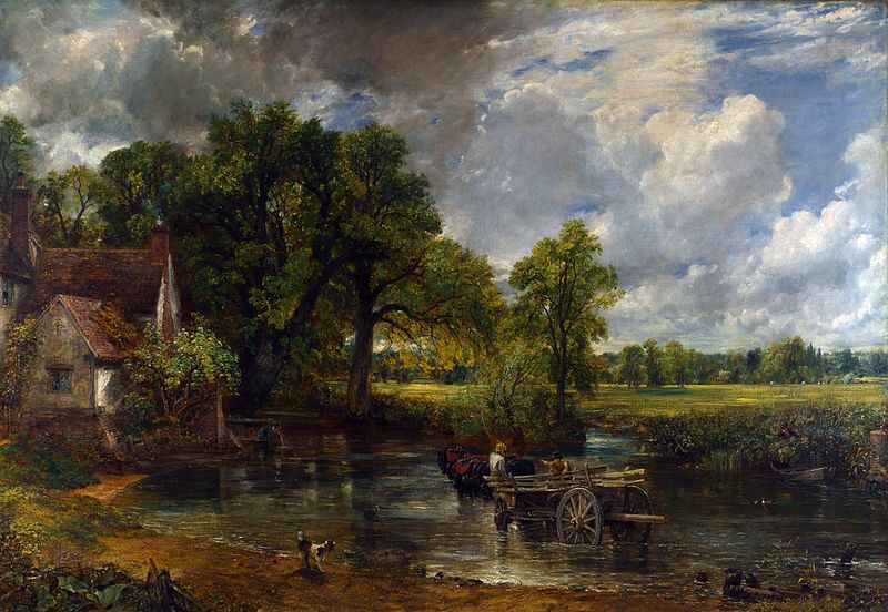
But, I don’t fully agree with the remark of Pissarro↑. When we look closely at works of Constable, we see that he used greenish shades. In his famous The hay wain he used for the shadows in the field dark greens. This was already in 1821. He did the same in a tree study made around 1821. Later Monet, Rouart and Calls also rendered shadows in this way.
S1824, Constable, 1821, The Hay Wain, 130×185, NG London
John Constable (1776-1837): 1821ca, Study of the trunk of an elm tree, 31×25, VAM London (M65)
Claude Monet, 4IE-1879-155, Un jardin (1867) = CR68, 1867 (or 1866), Jeanne-Marguerite Lecadre in the garden, 80×99, Hermitage (iR51;R22+R127,CR68;R90II,p135;R2,p269;R15,p165;M95,no.6505)
Adolphe-Félix Cals, 6IE-1881-hc2, unknown title. Very uncertain: 1876, Un dimanche à Saint-Siméon, 55×84, MB Honfleur (R51,p91;R45,p68;R2,p356;R90I,p354). Compare: 4IE-1879-42, Le dimanche à Saint-Siméon, Honfleur (dessin).
Henri Rouart: 1876ca, Lisière de Bois (Landscape with Bathers), 151×181, Gallery London (iR13;aR4;iR134;iR24;R2,p314) =?? 5IE-1880-181, Paysage. =?? DR1912/03-42, Baigneuses dans une prairie bordée de grands arbres. Appartient à Mme. Grimault.
Purple shades:
In the mid 1870s the Impressionists started to use purple shades. I see this as one of the main characteristics of the mature impressionist painting style.
Camille Pissarro: 3IE-1877-166, Jardin des Mathurins, à Pontoise. Now: CCP448, 1876, Garden at Les Mathurins, 113×165, NAMA Kansas City (iR10;iR6;iR59;iR2;R2,p231;R116,CCP448;R90II,p81+99;M42)
Auguste Renoir: 3IE-1877-196, La place Saint-George =? 1875ca, Place de la Trinite, Paris, 50×61, private (iRx;R30,no196;R2,p206;R90I,p180;R88I,p93) =? Rejected Caillebotte bequest, La Place Saint-Georges.
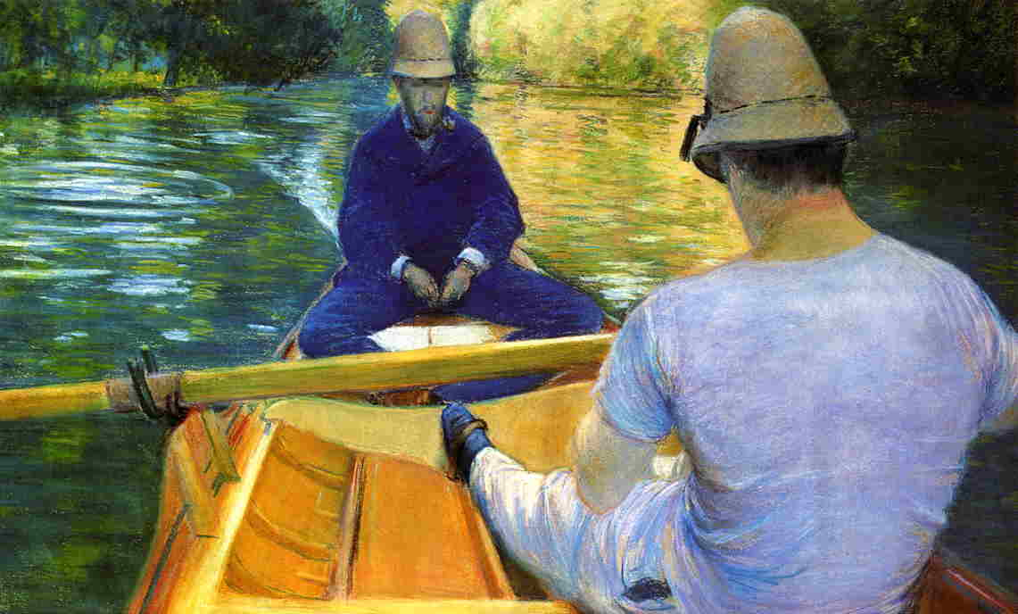
Gustave Caillebotte: 4IE-1879-27, Canotiers (pastel) = 1877, SDbr, 1CR77+2CR84, Boaters on the Yerres, pastel, 52×86, private Paris (iR2;R2,p267;R90II,p107+125;R101,no77;R102,no84+p283) Expo: DR1894-98.
Armand Guillaumin, 5IE-1880-74, Paysage à Fontenay-aux-Roses =??? 1878, Arbres en Île-de-France, 53×65, A2011/05/04 (iR2;iR11;R2,p212)
Lila shades:
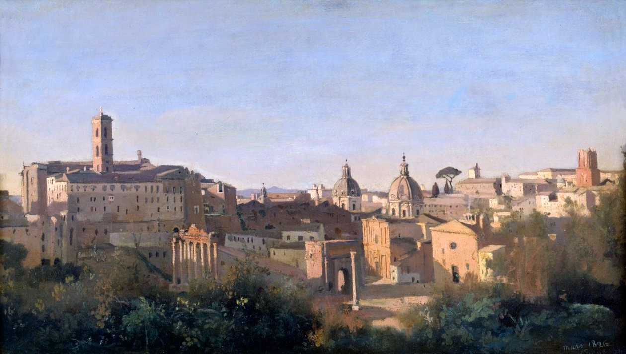
When we look closely, we can see that Corot used lila shades in some early works. Already in 1826 in his View of the Forum Corot rendered lila shadows (R61,no3+p19;R119,no67). Around 1876 Béliard and Caillebotte also used lila shades.
Corot (1796-1875): 1826, CR67, The Forum seen from the Farnese gardens, 28×50, Louvre (iR155;iR10;iR6;R61,no3+p19;M5)
Corot (1796-1875): 1855-65, CR1464, The road from Sèvres, looking towards Paris, 34×49, Louvre (iR2;R61,no37;R119,no1464;M5)
Edouard Béliard: 1860-76ca, Sbr, Banks of the Oise (Quai du Pothuis), 33×45, A2007/12/13 (iR2;iR14;iR41) Expo: =?? 2IE-1876-1, Bord d’Oise; Compare: 2IE-1876-7, Rue Dorée, à Pontoise
Gustave Caillebotte: 1876ca, 1CR33+2CR39, S-, The garden in Yerres, 59×81, private (iR2;R101,no33;R102,no39) =?? 2IE-1876-22, Jardin.
Armand Guillaumin: Armand Guillaumin can be seen as a key-Impressionist, but sadly he is quite forgotten. When we look at some early works we see a bold and colourfull use of shades, including lila and purple shades. In this sense he was ahead of his fellow impressionists. But, Guillaumin in the early 1870s didn’t consistently use colourfull shades.
Armand Guillaumin: 1869, CR5, SDbr, Chemin de creux, effet de neige, 66×55, Orsay (iR2;iR35;R3,p69;iR1;R124,no5;M1) =former Gachet collection; =?? SdR-1873-333, Effet de neige par un beau temps
Armand Guillaumin, 3IE-1877-65, Rue de Saint-Cloud, à Clamart + 70, Rue de Trosy, à Clamart + 73, Rue, à Clamart = ?? 1870, CR-, SDbl, A street in Île-de-France, 73×59, A2016/05/13 (HW;iR15;iR11;iR2;R2,p204)
Armand Guillaumin, 5IE-1880-66, Port d’Austerlitz, effet de neige =!? 1871-73ca, CR43, Place Valhubert, 65×81, Orsay (iR2;iR23;iR59;iR35;iR6;R2,p311;R90II,p150+166;R179,p20;R124,no43;M1) =? SdR-1873-333, Effet de neige par un beau temps
Neo-Impressionists:
The Neo-Impressionists made an analytic study of colours. They rendered shades with pure colours, applied on the canvas with dots of paint (Pointillism) are mosaic like patches. They did so in a consistent manner. See for example these paintings of Signac and Luce.
Maximilien Luce (1858-1941): 1894, SDbr, Quay at Camaret, Finistère, 89×117, MFA Springfield (iRx;R306,no17;M164) =? Paris-1894-1 =LE-1895-383 =Bing-1896-126bis
Colourfull shades:
Here below you will find several examples of colourfull shades rendered by the Impressionists.
Camille Pissarro: 6IE-1881-81, Une rue à Lower Norwood, environs de Londres, gouache; appartient à M. Rouart =1871ca, CR1312, All Saints church, gouache, 18×23, A2014/11/06 (iR11;iR2;R90II,p183+194;R126,CR1312;R2,p355;R116II,p160) Former Rouart collection.
Armand Guillaumin: 6IE-1881-47, Route de Vanves-à-Clamart =? 1872-73ca, Rue de Clamart à Vanves, 50×62, A2005/02/09 (iR2;iR11;R2,p354) =!? Viau sale, DR1907/03/19-38, La Rue de Clamart à Vannes, Juin 1873; 4 heures de l’après-midi.
Auguste Renoir: 1873 (or 1869), La Grenouillère, 45×56, Milwaukee AM (iRx;R30,no95;R31,p192)
Alfred Sisley: 1879, SDbr, CR341=CCPP364, Winter sun in Veneux-Nadon, 50×65, A2020/02/06 (iR11;iR10;R90II,p213+234;R90I,p407;R129,no341;R396,no364) Provenance: 1882/02/10-1921/0214 Durand-Ruel; Expos: compare: 7IE-1882-176, Soleil d’hiver à Veneux; =GP1897-32.
Federico Zandomeneghi, 6IE-1881-166, La place d’Anvers = 1880, CG77, SDbr, Place d’Anvers, Paris, 100×135, Piacenza GAM (iR2;iR6;iR59;R2,p369;R3,p542;R89,no85;R203,no44;R204,no77;M106)
Auguste Renoir: 7IE-1882-155, Marroniers en fleurs = 1881, Chestnut tree blooming, 71×89, Sm Berlin (iR52;iR59;R30,no474;R90II,p211+231;R2,p395;M52)
Camille Pissarro, 6IE-1881-75, Village de la Mayenne, gouache; appartient à Mlle Cassatt. Compare: 1881, Paysage à Melleray, femme donnant à boire à des chevaux, gouache, 35×46, A2015/11/05 (iR11;R2,p355;R90II,p287)
Claude Monet: 7IE-1882-77, À Grainval, près de Fécamps. Now: CR653, 1881, SDbr, At Grainval near Fécamps, 61×80, private (iR51;iR2;R22,no653;R90II,p206+222;R2,p395+404) Provenance: 1881/04 Durand-Ruel. Expos: =4EIP-1885-74; =3XX-1886-8; =NY-NAD-1886-297.
Auguste Renoir: 7IE-1882-161, Près de Bougival. Uncertain option 1: 1881ca, Canotage à Bougival, 54×65, A2017/02/28 (iR10;iR15;R185I,no146;R30,no453;R2,p394) Durand-Ruel collection
Gustave Caillebotte: 1885, Sbr, 1CR310=2CR334, The Argenteuil bridge and the Seine, 65×82, Josefowitz coll Lausanne (iR2;iR11;R17,p155;R41,p17;R3,p244;R101,no310;R102,no334) Expos: compare: 7IE-1882-17+hc1, La Samaritaine; =DR1894-21. Provenance: 1885ca Eugène Lamy; 1894 Decap.
Paul Signac: 8IE-1886-186, Le moulin de Pierre Hâlé, Saint-Briac =1885, CR92, opus 100, Saint-Briac, Pierre Hâle’s windmill, 60×92, private (iR10;iR135;R2,p446+470;R106,no92;R90II,p253+277) =2SdI-1886-372.
Armand Guillaumin: 8IE-1886-64, Chaumières à Damiette =? 1882-88ca, 2CR, Chaumières, Village, Île-de-France (à l’ami Portier), 54×65, A2015/06/24 (iR14;iR11;R310,no74;R2,p445;R90II,p244)
Armand Guillaumin, 8IE-1886-68, Prairie à Damiette =!? 1885, CR137, Village sur le côteau, vallée de Chevreuse, 90×116, A2018/11/13 (iR11;iR14;R2,p445;R90I,p428+447) =!? Viau sale, DR1907/03/02-21. Paysage; Damiette (Seine-et-Oise), 1885.
Émile Schuffenecker: 8IE-1886-169, étude de neige =? 1886ca, CR350, Étude de neige (Snowy Landscape), 47×56 , A2021/03/30 (iR2;iR15;R54,no188;R209,no350;R2,p446) =V1889-72, Dans la neige (aR1=iR19).
Émile Schuffenecker: 8IE-1886-169, étude de neige =? 1886ca, CR350, Étude de neige (Snowy Landscape; detail), 47×56, A2021/03/30 (iR15;iR2;R54,no188;R2,p446) V1889-72, = Dans la neige (aR1=iR19)
Camille Pissarro, 7IE-1882-133, La récolte des haricots verts, gouache. Compare: 1887, Picking Peas, gouache, xx, private (iR2;R2,p394)
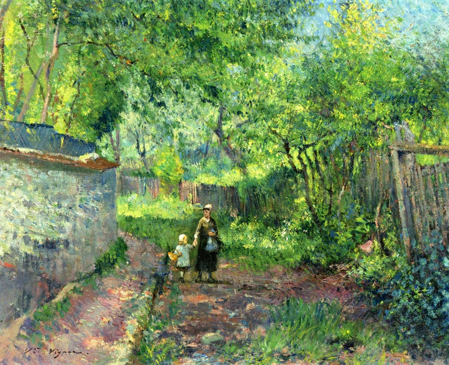
Victor Vignon, 6IE-1881-163, Chemin vert à Bougival. Maybe??: 18xx, Mother and Child taking a Walk (Mère et enfant se promenant), 32×41, A2006/05/04 (iR2;iR14;iR13;R2,p356;iR1;R90I,p328)
Victor Vignon, 7IE-1882-193, La Sente d’Auvers. Maybe?: 18xx, View of Auvers-sur-Oise, 32×41, A2017/05/19 (iR2;iR11;iR41;R2,p394;iR1;R90I,p377)
Camille Pissarro, 7IE-1882-115, Chemin montant. Maybe??: CCP666, 1881, The path to Les Pouilleux, Pontoise, 56×47, private (iR10;iR136;R116,CCP666;R2,p394) Durand-Ruel collection
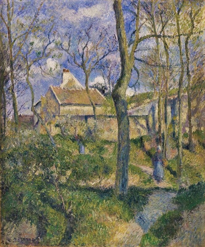
Camille Pissarro: 1879, CCP575, (A path) in the woods in Autumn, Pontoise, 81×66, A2001/02/05 (iR10;iR235;iR14;iR13;iR2;R2,p312+394;R90II,p152+169;R116,no575) Provenance: 1880 Caillebotte; 1896 bequest refused. Expos: =5IE-1880-131, Automne, chemin sous bois; =?? 7IE-1882-116, Sentier au bois d’Ennery.
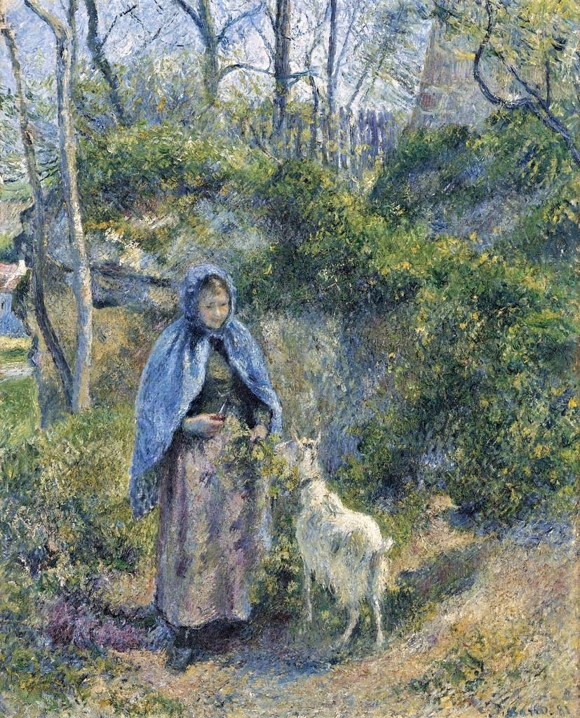
Camille Pissarro: 7IE-1882-120, La gardeuse de chèvres = 1881, CCP656, The goat girl, 81×65, Metropolitan (iR10;iR94;iR59;R116,CCP656;R2,p395;R90II,p209227;M23). Compare: 6IE-1881-80 and 7IE-1882-135, gouaches with the same title. Bought by Durand-Ruel 1881/06/13; =DR1883-56; =Boston-1883-50; =London-DG-1884; =Boston-1891-1=New-York-DR-1903-9;
Auguste Renoir: 7IE-1882-157, Jardin Desaix à Alger =1881-82, The Jardin d’Essai in Algiers, 81×65, private Paris (iRx;R30,no514;R90II,p211+232;R2,p395)
Mary Cassatt: 8IE-1886-7, Jeune fille à la fenêtre, appartient à M. Berend = 1883-84ca, CR125, Susan on a balcony holding a dog, 100×65, NGA Washington (iR92;iR2;iR59;R2,p449;R90II,p257;R44,p23;M21)